The Art and Science of Web Design: A Comprehensive Guide

The Art and Science of Web Design – In the ever-evolving landscape of the digital world, web design plays a pivotal role in shaping online experiences. It’s not just about creating visually appealing layouts; it’s about crafting an immersive journey for users, blending aesthetics with functionality seamlessly. This comprehensive guide delves into the intricate realm of web design, exploring its various facets, principles, and the evolving trends that shape the online landscape.
The Art and Science of Web Design: A Comprehensive Guide
A. Understanding the Basics
1. What is Web Design?
- Web design is the process of creating and arranging visual elements on a website. It involves a combination of graphic design, user interface (UI) design, and user experience (UX) design principles to ensure a website is aesthetically pleasing and user-friendly.
2. Key Components of Web Design
a. Layout:
- The arrangement of elements on a webpage, including text, images, and multimedia.
b. Color Scheme:
- The selection of colors that evoke the desired emotions and complement the brand.
c. Typography:
- The choice of fonts and their arrangement for optimal readability and visual appeal.
d. Images and Graphics:
- The use of visuals to enhance the overall design and convey information effectively.
e. Navigation:
- Designing intuitive navigation menus and structures for easy user interaction.
f. Responsive Design:
- Ensuring the website functions seamlessly across various devices and screen sizes.
B. The Principles of Web Design
1. Balance and Symmetry
- Balance in web design refers to the distribution of elements on a page to create a visually appealing layout. Symmetry, whether formal or informal, contributes to a sense of order. Achieving balance ensures that no single element overpowers the others, creating a harmonious design.
2. Contrast and Emphasis
- Contrast involves highlighting the differences between elements, such as color, size, or shape. This helps draw attention to specific areas, creating emphasis and guiding the user’s focus.
3. Unity and Consistency
- Unity ensures that all elements on a webpage work together to create a cohesive design. Consistency in design elements, such as fonts, colors, and spacing, enhances the overall user experience and reinforces the brand identity.
4. Hierarchy
- Establishing a visual hierarchy helps users understand the relative importance of each element on a page. This guides them through the content in a logical and intuitive manner.
5. Whitespace (Negative Space)
- Whitespace is the empty space between design elements. It enhances readability, reduces visual clutter, and allows users to focus on the essential elements of a webpage.
C. The Role of User Experience (UX) Design
1. Understanding User Behavior
- Successful web design goes beyond aesthetics; it prioritizes understanding user behavior. UX design focuses on creating a seamless and enjoyable experience for visitors, taking into account their needs, preferences, and expectations.
2. User Research
- Conducting thorough user research involves understanding the target audience, their demographics, and behavioral patterns. This information informs design decisions and ensures the end product aligns with user expectations.
3. User Personas
- Creating user personas helps in personifying the target audience, making it easier to tailor the design to their specific needs and preferences.
4. Wireframing and Prototyping
- Before diving into the visual design, creating wireframes and prototypes allows designers to outline the structure and functionality of a website. This iterative process helps refine the user experience.
5. Usability Testing
- Usability testing involves gathering feedback from real users to identify any usability issues and make necessary improvements. This iterative approach ensures the final design meets user expectations.
D. The Visual Elements of Web Design
1. Color Theory
- a. Psychology of Colors: Understanding how different colors evoke emotions and impact user perception.
- b. Color Schemes: Exploring various color schemes, such as monochromatic, complementary, and analogous, to create visually appealing designs.
- c. Branding Colors: Aligning the website’s color palette with the brand’s identity for consistency.
2. Typography in Web Design
- a. Font Selection: Choosing fonts that align with the brand and enhance readability.
- b. Hierarchy of Text: Establishing a clear hierarchy through font size, weight, and spacing to guide users through content.
- c. Responsive Typography: Ensuring text is legible across different devices and screen sizes.
3. Images and Graphics
- a. High-Quality Visuals: Using high-resolution images and graphics to enhance the overall aesthetics.
- b. Optimization: Compressing images to optimize website performance without sacrificing quality.
- c. Iconography: Integrating icons to convey information concisely and enhance user understanding.
4. Layout and Grid Systems
- a. Grid-Based Design: Implementing grid systems for consistent alignment and organization of elements.
- b. Whitespace: Leveraging negative space to improve readability and create a visually pleasing layout.
- c. Responsive Layouts: Designing layouts that adapt to different screen sizes, ensuring a consistent user experience.
E. The Technical Side of Web Design
1. Coding Languages in Web Design
- a. HTML (Hypertext Markup Language): The backbone of web content, defining the structure of a webpage.
- b. CSS (Cascading Style Sheets): Controlling the presentation and layout, including styling and visual elements.
- c. JavaScript: Adding interactivity and dynamic features to web pages for an enhanced user experience.
2. Content Management Systems (CMS)
- a. WordPress: A popular CMS that allows for easy content creation and management.
- b. Joomla and Drupal: Alternatives to WordPress, each with its own strengths and use cases.
3. Responsive Web Design
- a. Media Queries: Using CSS media queries to adapt layouts to different devices and screen sizes.
- b. Mobile-First Design: Prioritizing the mobile experience and progressively enhancing for larger screens.
4. Web Performance Optimization
- a. Page Load Speed: The impact of website speed on user experience and search engine rankings.
- b. Image Compression: Techniques for optimizing images to reduce load times.
- c. Minification and Compression: Streamlining code to improve website performance.
F. Current Trends in Web Design
1. Dark Mode
- a. Benefits: Reduced eye strain and improved visibility in low-light environments.
- b. Implementation: Design considerations for integrating dark mode seamlessly.
2. Microinteractions
- a. Definition: Small, subtle animations or responses to user actions that enhance the overall experience.
- b. Examples: Animated buttons, hover effects, and feedback animations.
3. Neumorphism
- a. Definition: A design trend that combines elements of skeuomorphism and flat design, creating a soft, three-dimensional appearance.
- b. Implementation: Guidelines for incorporating neumorphic elements into a design.
4. Voice User Interface (VUI)
- a. Rise of Voice Assistants: The impact of voice-controlled devices on web design.
- b. Design Considerations: Adapting interfaces for voice interaction and accessibility.
G. Best Practices for Web Design
1. User-Centric Design
- a. User-Centered Approach: Placing the needs and preferences of users at the forefront of the design process.
- b. Feedback Loops: Regularly gathering feedback and making iterative improvements based on user input.
2. Mobile-First Design Strategy
- a. Importance of Mobile Optimization: The prevalence of mobile users and the need for a mobile-friendly design.
- b. Responsive Design Principles: Adapting layouts and content for optimal mobile viewing.
3. Accessibility Standards
- a. WCAG Guidelines: Web Content Accessibility Guidelines and their importance in inclusive design.
- b. Accessible Design Elements: Ensuring all users, including those with disabilities, can access and navigate a website.
4. Cross-Browser Compatibility
- a. Browser Testing: The significance of testing websites on different browsers to ensure a consistent user experience.
- b. Compatibility Issues: Common challenges and how to address them for various browsers.
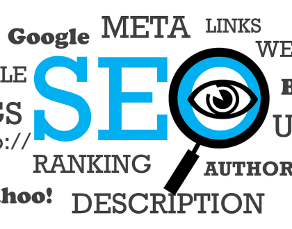
H. The Impact of Web Design on SEO
1. Mobile-Friendly Design and SEO
- a. Google’s Mobile-First Indexing: How Google prioritizes mobile-friendly websites in search rankings.
- b. Responsive Design Benefits: Improving user experience and search engine visibility through responsive design.
2. Page Load Speed and SEO
- a. Core Web Vitals: Google’s metrics for measuring user experience and their impact on search rankings.
- b. Optimizing Performance: Strategies for improving page load speed and overall website performance.
3. Content Structure and SEO
- a. Header Tags: The importance of using proper header tags for content organization and SEO.
- b. Semantic HTML: Structuring content in a way that search engines can understand and index effectively.
Conclusion: Art and Science of Web Design
In the dynamic world of web design, the convergence of aesthetics, functionality, and user experience defines the success of a website. From the fundamental principles of design to the intricacies of coding and the ever-evolving trends, every aspect plays a crucial role in creating a digital masterpiece. As technology advances and user expectations evolve, staying at the forefront of web design practices is essential for crafting compelling online experiences. Whether you’re a seasoned designer or a novice embarking on this creative journey, this comprehensive guide serves as a roadmap to navigate the fascinating landscape of web design. Embrace the art and science of web design, and let your creativity shape the digital future.
Recommended Posts
Local SEO vs. Global SEO: A Comprehensive Guide
May 14, 2025